Sunday, 30 December 2012

Saturday, 22 December 2012

This time I used a command within Photoshop which merged the three images, converted to black and white and used all automatic settings. Think this worked a little better than the hour I spent messing about
It also only took a fraction of the time at approx 2 minutes
This was one of my images from the studio, but I always felt the eyes were too dark.
I decided to save three copies at different exposures as tiffs rather than jpegs as not to compress the file.
I then over-layed the three images and altered to black and white


Overall I think this brought my image to life, bringing detail not only to the eyes but also to various sections of the jacket and buckles.

You can get carried away with this process and should try to capture everything in the studio with the camera

Thursday, 20 December 2012

Other things which would need to be taken into consideration

  • who's the image for
  • what the image is for
  • what your trying to put across
  • what age group are you aiming it for
  • the environment / surroundings you are in
  • is the image for a magazine, if so will the image require space
  • composition
  • mood
So much requires thought, but should come naturally with experience and practice, even just walking into a situation without your camera and looking at where you are, the available light, the direction of the light, the colours etc.
After doing further research and more reading, I don't think it is as easy as choosing your lighting and knowing what your going to do. I think you need to step back and look at your subject in the environment to help decide what sort of lighting etc you are going to choose.
some faces work better in black & white, some in high saturation, low saturation, high key, low key, full on, profile etc.
You need to consider every aspect.

Wednesday, 19 December 2012

A scan out of my book "The Portrait Photographers Lighting Style Guide"
Section on full faces
Not just because Carl Foggarty was a hero of mine, but this is an awesome portrait for me, capturing the intensity of his gaze, which he was renown for during his reign as British & World Superbike champion
 Again another HDR portrait from the same book, showing how almost cartoony images can become.

 This image was under the section "low Saturation", but I dont think the scan gives it full credit, looks a lot better in the book obviously
 Section on using Ring Flash and other types of lighting


and various types of portraiture such as Travel and Street


Tuesday, 18 December 2012

Due to my inexperience within the studio environment, I put together a sort of check list complete with a few inspirational images for when I'm in the studio. Hopefully this will help to stop my mind from going a little blank and help me focus at the task at hand.
I get in the studio and know what I'm after, but then get a little excited and carried away and stray from my actual first idea. I think this is also to do with having so many different ideas and wanting to get as much as possible done in such a short period of time.

Monday, 17 December 2012

My attempt at HDR


H.D.R. Portraits

 a technique of utilising an over exposed image, an under exposed image and a correctly exposed image over-layed to bring out extra detail within the shadow areas and highlight areas, which sometimes can be overdone and you can start to get an almost pop arty feel to it.

Pop Art Portraiture


 Originating in Britain in the mid 1950s started by several subversive artists and made popular by Andy Warhol


Saturday, 15 December 2012

Well - gone thru 2 studio shoots expecting to have around 2 dozen images to choose from to have at least 6 prints to be able to submit.
100 images deleted and down to approx half a dozen to choose from, think I have only got 4 images sharp enough to actually submit.
Took me a good 3 hours to get to these half dozen and now just feel gutted LoL
Doesn't leave me much time to sort, unless I tried to carry something out at home, but wouldn't expect the quality to be anywhere near good enough to submit.
2 more of my images from my last studio shoot


My version
2 mins on Lightroom
I just don't like the idea of digital manipulation too much as I would prefer to capture as much as possible in camera and in the studio
I think it is more professional and shows more experience, understanding and knowledge to be able to carry out the majority before resorting to the aide of software.


SEE - I just wake up on a morning with my head flooded with ideas that just need reigning in and almost taming. I get all excited and need to just jot a few of them down to maybe use later as projects.
And I'm still thinking of getting set up in a farmers corn field to capture the elusive scarecrow
Queen - Bohemian Rhapsody
must be the most well known iconic images of just using the faces within an image


With the inclusion of the hands within this image I think adds a lot more to the overall impact


The idea of just the heads must have been sub-conciously at the back of my mind
Used to watch this video all the time

The video to "She Makes Me Move " - N.E.R.D. I think would be able to be replicated in the studio.
The very dark image I took of Matt is nearly there, so I could replicate that lighting, fast shutter speed and small aperture of around F22, 1 studio light positioned maybe directly in front but above the subject.
Make sure the subject had a black round neck jumper and maybe even a gel over the flash to replicate the colour cast.

Fun portraits

These sort of images gave me the idea of just using the idea of just the head in the centre of the A3 sheet, with no shoulders, neck etc or positioned in various locations within the sheet.

Friday, 14 December 2012


Giovanni Bellini- Portrait of the Doge Leonardo Loredan 1501-5

I first came across this in contextual studies and it blew me away then, for an actual painting how close to a photography studio portrait it is.


Antonella Da Messina-The Annunciation  c.1475

I can even see how close a few of my studio images are using the same sort of lighting, one light approx 45 degree angle above the subject and to one side.

Thursday, 13 December 2012

We had a discussion today on portraits, and how diverse it can be, what people expect and how different their expectations. We also discussed that there are three points to consider

  • the photographer
  • the subject
  • the viewer
Now - if we take these points into consideration, we have to think about who is going to be looking at our final images, which is the person who is going to be marking and grading our portraits.

If I was an FDA student I would be looking at this brief a little different and be trying to aim my final images at the general public and trying to produce a commercially acceptable image, that at the end of the day would draw people in to my studio, but I'm not - I am an arty farty BA student who should really take a back drop and portable lights out into a farmers field and set it up for taking a picture of  a scarecrow, or setting something up in the studio with my model in a certain way to capture nothing but their shadow or even just the back of their head.
I understand before you can run you first have to crawl and then walk, but with such an open brief as "deliver 3 portrait images" are we to show first that we understand you need to show; catch lights in the eyes to bring them alive, have the person looking down the lens and giving some emotion or feeling (communicating with the viewer), have an even well lit background, everything completely in focus, show that we have had some sort of communication with our subject or can we break some of the rules to produce something a little different - only to get it wrong in printing and end up with orange skin and realise the scarecrow was the best option.

Chuck Close

Great artist as well as portrait photographer


Simple yet effective and dramatic images


Yet he does a lot of self portraiture - is this where the vanity side of portraiture comes in to it, where people thought they were imortalising themselves for ever.


Wednesday, 12 December 2012

Been playing around with Lightroom and Photoshop to develop my images ready for printing to see which I prefer. Lightroom for me comes out on top, still think Photoshop is more geared toward graphics and in my opinion for people with no experience at actually taking a photograph.

Tried printing a few images out and I'm still not getting the colour reproduction quite the way I would like. Also noticed, depending on which application I use

  • Lightroom
  • Photoshop
  • Preview
  • Printers own software
the colours come out a little different.

Tuesday, 11 December 2012


This time I was using the same lighting, same position, but just asked the subject to move his eyes


I'm probably going to get a comment like "fashion photography", but I would have to disagree - the subject has no dare I say "fashion sense", is not trying to keep up or copy fashion and just is himself with his own identity, albeit a mix and match of certain characters from everyone of his favourite films. This is how we see him every day and that is what I have tried to capture - a mood less mathematician with nothing more than Pythagoras on his mind.
I preferred the lighting on this composition, using just the one light and trying to capture a triangle of light in the shadow of the dark side of the subject - Rembrandt esq.

This image needed a bit of extra exposure in Lightroom as the eyes were totally lost from the shadows, a reflector could have been used, but I chose not too on purpose, as i was experimenting with cast shadows.

my first image was going to have a religious them, but with the wrong lens (50mm would have been better) I didn't have enough space to get a full shot in the pose i wanted, may be studio 1 would have been better for what I was after.


The second image I was experimenting with a shadow cast over the eyes
with all that in mind and looking over my images (my portraits) I think I may like to get back in the studio and start producing something that may be able to communicate an idea, may be experiment a little. But with time being the biggest factor, I don't have long left.
So - back to the original question / brief
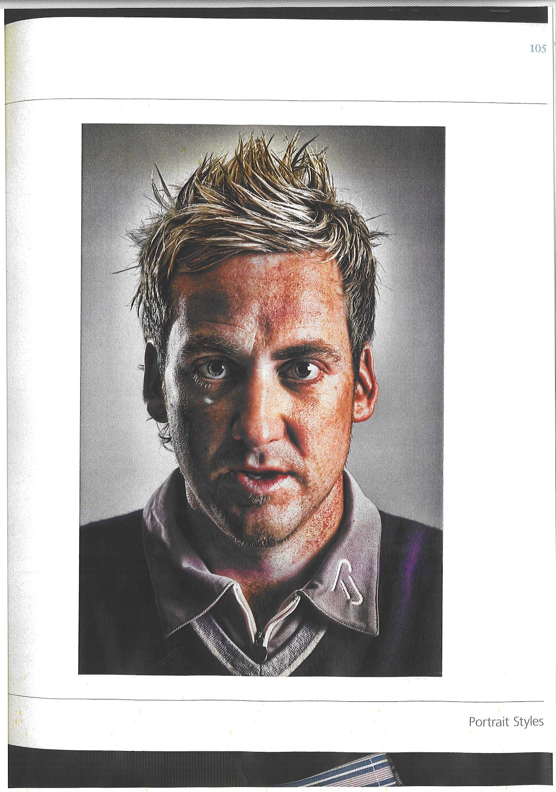
Produce a series of portraits - an introduction to the studio and workflow, but the main point "the theory of visual language
Visual language - the system of communication through visual elements

  • an image that communicates an idea
  • an image that presupposes the use of visual language
  • the use of form, shape, colour, texture, angle, scale, direction, motion
  • spacial context
With that in mind then, do i need to put across an idea, do i need my image (portrait) to portray what i was thinking at the time.
What if i wasn't trying to put across any message apart from that i set the studio up in a certain way to produce a certain lighting effect and that i wasn't really trying to get my model to put across any emotion, but just to be the subject of my composition.
Does all the background have to be white, black, uniform, all the same shade, tone.
Does the model have to look down the lens, or even have a catch light reflected in the eye to make the eye look alive.
Is there a set of rules to follow - if so then they are there to be broken, twisted and basically to be turned upside down to be different from the 'norm'.
But to be able to break the rules surely you have to know them as to know why you broke them in the first place - otherwise isn't that just doing it wrong.

well, got a load of studio images, and to me they look quite good and i'm quite pleased. But I've got a feeling that they won't be classed as good enough. I know I need a lot more studio time as practice makes "perfect", it's just tricky to get the studio booked, model sorted, the hasselblad (and everything working) and time from work all at the same time. Studio work is a lot more time management, planning etc compared to our 'street photography'.
But then again lighting is a very personal subject and one persons preference will not always be to the majorities taste.

Monday, 10 December 2012

Had the studio this evening (monday 10th) from half 5, 150mm lens, Hasselblad, couple of lights.
Hopefully thats my images sorted, just going to need a few nights to go thru them all now and decide on half a dozen to get printed.

Monday, 3 December 2012

Not 100% happy with the images I have taken, still a little out of focus for my liking, so reckon I need to book a few more sessions in studio 2, but happy with my compositions and lighting - although probably not to everyone elses' taste.
It's all practice, but just trying to find the time. Had a practice at home (quad light continuous lighting & Bronica), not the same as the studio set up and using a Hasselblad.
Been sorting my raw images ready for printing, tried to print a few off at home just for now.
Must have gone thru a lot of ink and A3 paper, still not happy with the difference in colour when printed to that of on screen. Skin tones wrong and appears darker - can see this printer flying thru this window and spending the winter in a flower bed.

Saturday, 1 December 2012

I seem to be either drawn to very high key / over exposed portraits or the complete opposite - dark on one side of the face, with lots of shadows.
Not really a fan of just colour and properly lit and wat everybody would class as a nice clean image.
But there again, it's all about personal taste and opinion.
Photography would be very boring if we all liked the same thing