Reynold Reynolds 'Burn'
Again another great concept, using film to produce a thought provoking piece of art where the inhabitants of a dwelling are surrounded by all their belongings on fire.
The amount of time setting up, testing and not to mention the cost of production. A lot of time has gone in to the initial ideas and you can see that it is not just mindless documentary, but communicates as a fully developed self initiated concept.
Paul Graham 'Beyond Caring'
This project could be classed as a social documentary, I would not have said so much of a narrative as the images were depicting different waiting rooms in the 70's / 80's and as such were a story within themselves and did not really flow as a narrative would.
The images showed a good depth of field with a wide angle lens, with plenty of the composition in focus.
I felt there was good harmony between the C-type prints and the format / framing of the display. The print was displayed in a very wide, thick off white window mount, which helped bring the subject matter to the forefront and give an overall aesthetically pleasing composition of what could be classed by some as an unusual subject matter.
Wednesday, 30 October 2013
Melanie Friend
I don't think it was quite fair that this artist followed straight on from the exhibit using light boxes. You had the sharp and detailed images of Craig Ames, then the large unframed, soft focused images of the next artist / photographer.
The project was to do with local air shows / aviation, whilst depicting families at play on the beach, with typical North East drab and grey weather.
For my personal taste I feel these images should may be have been displayed at a smaller scale, the only problem then would have been loosing the aircraft in the sky of every image.
After the last 4 weeks we have spent on our project considering lens choice, depth of field, focal point etc, I would have put a little more thought in to the camera and lens used for this project, but every artist / photographer is going to find their own desired style.
I was finding my eye had nothing really to settle on or focus in on, but this may have been the desired effect.
Craig Ames
Great concept, playing an interview of a retired soldier over the top of game footage from Call of Duty.
To think, ten years ago you couldn't even buy a plastic toy gun and now you have teenagers not really knowing the difference between fiction / fantasy and reality. Sitting in front of a screen for the full weekend, getting paler and paler, building up thumbs like biceps, loosing the use of their legs, talking to friends they have never even met, where is all this leading.
You can turn on your games console and become anything you have ever dreamt about!
His next project 'Kill Zone' which were images of top paintball locations, exhibited in light boxes was very inspirational. The images were so sharp and detailed, which was brought to life with the use of a black frame and light box behind. The detail within the compositions was transfixing, I could have spent all day looking at these images and still found something that I may have missed the first time.
Tuesday, 29 October 2013


Monday, 28 October 2013


Monday, 21 October 2013
So, another 8 images taken, this time on ISO 400 rather than 160. Stopped down 2 stops to slightly increase exposure and used a new 90mm lens rather than the 150mm.
Sent the negs away today and should have them back friday, hopefully with something to submit once printed off.
With the private road to South Gare closed yesterday and all the rain, didn't really get chance to retake the fisherman at his hut, going to have to wait till good weather one weekend.
Sent the negs away today and should have them back friday, hopefully with something to submit once printed off.
With the private road to South Gare closed yesterday and all the rain, didn't really get chance to retake the fisherman at his hut, going to have to wait till good weather one weekend.
Saturday, 19 October 2013


Thomas Struth

What I feel I now have to learn is how to analyse an image that does not appeal to me as a subject matter.
I find it very hard to explain, it is not that I dislike the images because I find them technically outstanding and appreciate the compositional elements, thought and concept, yet the actual subject matter does not stimulate enough for me to make that connection and instill the feeling of me wanting to look at more.
Technically the images are sharp, the photographer has already decided on his aperture to gain the best use of depth of field within his confined environment. Utilising a wide angle lens he is able to compose and capture a large number of family members, whilst keeping them all in focus. You can also see that the photographer has took full control and placed each family member within the composition to best utilise the available space and give a good sense of balance to the final image.
I get a strong sense of juxtaposition between vertical and horizontal, which helps to give a strong solid structure to the composition. This structure would also lead me to a sense of 'pace & rhythm', you would tend to flow through the image rather than struggle, they are easy to read and digest.
There is a definite synergy to the final images from the use of colour to help balance the composition and give an overall calmness and harmony to what could be an otherwise very active photograph, the term controlled chaos springs to mind.
Again I do not get the impression of mindless documentation, but rather a feeling of a strong concept where the photographer is utilising his vast experience whilst he developed a consistent personal style that aides in the final image communicating effectively to the intended audience.
In conclusion I can not deny that for a genre that does not stimulate my personal taste, Thomas Struth is probably for me one of the few photographers that can take the documentary family portrait with aplomb.

By Bryan Schutmaat from his "Grays The Mountain Sends' project
The first thing people do when they look at an image is make a connection, do they like or dislike the image, they make a personal judgement as to whether the photograph is aesthetically pleasing to their personal taste.
For me it was very aesthetically pleasing, which in turn captures my attention. It retains my gaze and encourages me to look closer.
Technically for me it was very sharp, the photographer focused in directly on the subjects eyes and brought a connection between the viewer and the subject. He used a shallow depth of field which helped emphasise the subjects eyes, and although we know it is a flat 2D image, the depth of field used brings the subject forward giving the optical illusion of realism, almost a visual appearance of three dimensional. If the photographer had used an aperture of say f32 to 45 everything would have been in focus and become a little flat. He had the subject far enough away from the background to completely blow it out of focus, so you do not even recognise what the background is, which helps to bring the subject to the forefront and isolate him. He is the main subject.
Compositionally I feel the photograph works very well, the top of the head has not been cropped off, the eyes are almost on the upper third horizontal intersecting line with the underside of the nose at the centre of the frame giving an overall sense of balance, utilising the full frame.
Colour and exposure work very well, you can see it is a colour photograph, but if feels as though it is drained of colour almost complimenting the expression on the subjects face, it does not have the vivocity of say a Steve McCurry colour portrait but more of a look of an early Saul Leiter.
From the subject himself I feel you get the impression he's been through the mill so to speak, a working man that has had his hard times and I would use the word 'drained' again.
The jacket and the colour give the sense of cold, he is dressed to keep warm, yet he does not give out the impression of being poor, which would beg the question 'is he still in work?'. Yet his expression is of hard times, almost a sadness.
I find the image a little passive, although my gaze does look around the image to take in the full composition, you always find your point of interest back at the eyes, almost seeing into the soul.
In conclusion I would say the image is very strong, it captures and holds your attention, it makes you ask questions. You can see with the title of the project that the image will work well as part of a narrative, which to me does not give the impression of mindless documentation but more of a personal visualised concept that will have evolved as the photographer progressed with each captured image.
Friday, 18 October 2013


This is the lens I have used throughout the project so far
http://www.linos.com/pages/mediabase/original/rodenstock_apo-sironar-n_e_2474.pdf

But that is just personal taste

Nice solid aluminium one for me, may be heavier but for me a lot more sturdy and I have a lot more confidence in it.

http://www.wista.co.jp/e_wista/e_show/e_camera/e_camera.htm

Basic Strategies in Reading Photographs
How a photograph is composed? By learning what visual elements the artist uses to communicate with you, you may appreciate better why you like or don't like a particular work of art.
- Develop visual literacy
- Learn the basic vocabulary used in formal analyses in the visual arts
- Combine content information with formal analysis to "read" (analyze) photographs
Formal analysis provides a basic common language in the visual arts. However, a description of a photograph based only on formal analysis would be incomplete. Photographers make decisions both about composition (arrangement of visual elements) as well as content (meaning) when taking photographs. Consequently, it is important to consider the artist's intentions for making a photograph of a particular subject. Finally, the historical and social context in which a photograph was made must also be carefully considered.
http://nuovo.com/southern-images/analyses.html#vocabulary
- DEPTH OF FIELD - The range of object distance within which objects are in satisfactory sharp focus, the limits being the establishment of a circle of confusion of greatest acceptable size.
- DEPTH OF FOCUS - The range through which the image plane (the emulsion of the film) can be moved backward and forward with respect to the camera lens such as defined under the depth of field and circle of confusion. This term is often confused with depth of field and vice versa.
In common English, Depth of Field is what the photographer is interested in; it is what is in acceptable focus in front of the lens. Depth of Focus is what only a technician is interested in; it is what is in focus behind the rear lens element which the film or image sensor "sees."
Kerry Lee
Kerry Lee
Wednesday, 16 October 2013
What did I learn today -
I learned it took me a full year to learn black and white printing, tonal difference, contrast, split printing, good neg - NUFF SAID LoL
Colour cast, too pink - nope, now too yellow, nope wrong it's too green, ahhh yes got it under exposed, no - nearly, nearly one more increment - got it - I'm colour blind Phew


Saturday, 12 October 2013

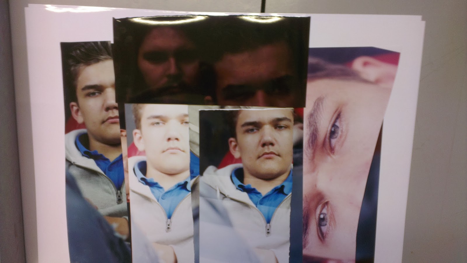
For the self portraits I found it easier to focus on something and then try and line my face up with the same object whilst using the different aperture settings to suit the brief - f5.6, f16, f45.
This helped show the difference on depth of field on the same composition, although with the sun going in behind clouds all the time it did effect my lighting.


Lens flare
Could be classed as a bit of a school boy error as I was aware of the sun moving as we were outside for an hour, Even the subject blinking, but i'd taken my eyes off the subject as I took the image and even thought at the time in the back of my mind that I was sure he blinked.
Lens flare is created when non-image forming light enters the lens and subsequently hits the camera's film or digital sensor. This often appears as a characteristic polygonal shape, with sides which depend on the shape of the lens diaphragm. It can lower the overall contrast of a photograph significantly and is often an undesired artifact, however some types of flare may actually enhance the artistic meaning of a photo. Understanding lens flare can help you use it — or avoid it — in a way which best suits how you wish to portray the final image.http://www.cambridgeincolour.com/tutorials/lens-flare.htm


My first attempts at actually talking to a subject and asking for their permission to allow me to photograph them.
Once I had struck up a conversation my nerves subsided just a little and it was not as bad as I thought it would be. I was still a little nervous, which I feel made me rush things. I know if I had slowed down a little more, took a deep breath - my images would have been a lot better.
But for my first attempt I felt quite good - I am always going to be critical of my images.
It was a bit too dark inside the hut, so we decided to bring a few of the objects out to include within the image; a double sided hand axe and a work bench.

Friday, 11 October 2013
COLOR CORRECTIONS IN THE DARKROOM
EVALUATE THE PRINT’S COLOR
Once you have printed a full-size trial photograph at the correct density, evaluate the print’s color. Assess the print under the same type of light source in which you will ultimately present it. If the presentation venue is not known, use daylight. Look for color casts that you can identify as red, green, blue, cyan, magenta and/or yellow. For example, the cast may be greenish, which indicates the presence of too much green. Or the cast may be purplish, which would indicate the presence of excess magenta and blue. Usually areas of the print that should be neutral gray are easiest to evaluate.
Instead of trying to identify a cast from six possible colors, you can halve the possibilities by determining whether the cast is warm or cool. On our color wheel, the warm colors are at the right of the vertical axis (magenta, red and yellow) and the cool colors are at the left of the axis (green, cyan and blue).

Great site for reading up on colour darkroom techniques
Basic colour darkroom printing theory
Color film instead of having one layer of emulsion has three, all of which are basically black and white film emulsion with one key difference. Each of these layers are made sensitive to different wavelengths of light by the introduction of carbo-cyanine dyes in the formulation of the emulsion; different dyes deliver different spectral absorption characterisitcs. The first layer is the blue sensitive layer. This layer is first because all film is inherently sensitive to blue light, and the blue emulsion requires the least amount of filtration. On top of the blue layer is an Ultra-violet filter. Next we find the green sensitive layer, this layer has a yellow filter layer above it and lastly we have the red sensitive layer under a red filter. Unlike black and white film, which has the silver in the emulsion reduced to metallic silver in the development process, color film actually has the silver halides that were exposed to light replaced with color dyes that correspond to the color layer. For example, when the film is processed the red layer has all of it's silver halides that were exposed to red light replaced with red dyes. The intensity of the dyes introduced are directly propotional to the amount of exposure the layer received. Once the film is processed the varying intensities in the three layers sandwiched on top of one another give all the different hues present in the original scene. Once developed the film is then placed in a bleaching bath which removes ALL of the silver in the film. leaving only the dyes.
There are two basic color systems in use today, these are the additive and the subtractive color systems. In the additive color system we work with Red Green and Blue. In the subtractive system we work with the colors Yellow Magenta and Cyan. the two systems derive their names by the manner in which they combine the colors. The additive system can be described as the combination of the three basic colors to achieve any color required. If for instance we add Red and Blue together in equal amounts we will get Magenta a sort of purple color. By varying the amounts of red and blue we get all the colors that reside in the spectrum between red and blue. The same is true with regards to the combination of blue and green and green and red. The interesting thing about the additive system is that if we combine all three colors we get white. This is because white is the presence of all colors.
There are two basic color systems in use today, these are the additive and the subtractive color systems. In the additive color system we work with Red Green and Blue. In the subtractive system we work with the colors Yellow Magenta and Cyan. the two systems derive their names by the manner in which they combine the colors. The additive system can be described as the combination of the three basic colors to achieve any color required. If for instance we add Red and Blue together in equal amounts we will get Magenta a sort of purple color. By varying the amounts of red and blue we get all the colors that reside in the spectrum between red and blue. The same is true with regards to the combination of blue and green and green and red. The interesting thing about the additive system is that if we combine all three colors we get white. This is because white is the presence of all colors.

The subtractive system on the other hand works by the act of cancellation of different light (or subtraction if you Will). If we place three lights, each with a different filter in front of them, one with a magenta filter one with a cyan filter and one with a yellow filter, so they can shine on a wall in a manner in which all three lights will intersect with each other we will see the following. In the area where yellow and magenta combine we will see red at the intersection, likewise we will see green at the point where cyan and yellow combine and finally we will see blue at the point where cyan and magenta combine. Just as there was a unique quality in the additive process there is an even more bizarre quality in the subtractive. If we combine all of the colors of the subtractive process together we will achieve black at the point where all the colors intersect. This is due to the fact that the three colors cancel each other out, as it were, and yied the absence of all color, or black.

This brings up the point of complimentary colors. Complimentary colors refers to the manner in which the two systems interact with one another. For example if I were to print a negative and I found that the whites in the print are too red I can "cancel out" this effect by adding cyan. If you look at the above diagram you will see that Cyan is directly opposite of red and that the two colors point of commonality is black. This is how the cyan is able to cancel out the red. Consequently Yellow and blue are complimentary as are magenta and green.
photo.net
Wednesday, 9 October 2013
Tuesday, 8 October 2013


Monday, 7 October 2013
Just finished some colour negs at three different aperture settings (f5.6, f16, f64), so thats ten negs getting sent off today, hopefully back for the weekend, then need to do some colour printing next week. The f64 neg will have a little blurred motion due to the windy conditions and the required shutter speed of half a second, where as the shutter speeds of the other aperture settings should have been quick enough to freeze the movement. Only time will tell.
Done about a dozen black and white negs, bit more processing this evening and then can do black and white printing this week.
One neg was scratched, one neg had a few bubbles from developing, one the subject blinked and one or 2 were just ever so slightly out of focus around the eyes. Great learning curve, but a huge difference to shooting digital.
Fingers crossed the colour ones have a better hit rate.
Saturday, 5 October 2013
Side Gallery
Great place to experience other photographers work, I visit quite regular in newcastle
http://www.amber-online.com/sections/side-gallery
Great place to experience other photographers work, I visit quite regular in newcastle
http://www.amber-online.com/sections/side-gallery
Friday, 4 October 2013
Comparison of Color Film Photography Brands and Types
Brand
|
Name
|
ISO
|
Grain
|
Notes
|
Fuji
|
Reala-100
|
100
|
Highly Uniform Fine Grain
|
Natural color reproduction, sharp results, wide exposures.
|
Kodak
|
Ultra-100
|
100
|
Finer
|
Vivid color for outdoor use.
|
Fuji
|
Pro-160S
|
160
|
Very Fine
|
Natural colors, smooth tones, very sharp.
|
Kodak
|
Portra-160
|
160
|
Very Fine
|
Vivid color across the spectrum; used for indoor and outdoor.
|
Fuji
|
Superia-200
|
200
|
Fine
|
Vivid color across the spectrum with general use.
|
Fuji
|
Superia-400
|
400
|
Finer
|
General use.
|
Fuji
|
Pro-400
|
400
|
Fine
|
Superb color with wide exposure latitude.
|
Kodak
|
Portra-400
|
400
|
Fine
|
Natural color across the spectrum; very flexible.
|
Kodak
|
Ultra-400
|
400
|
Fine
|
Vivid color for outdoor use.
|
Fuji
|
Pro-800Z
|
800
|
Some noticeable grain
|
Faithful reproductions for low light, wide exposure range.
|
Kodak
|
Portra-800
|
800
|
Some noticeable grain
|
Vivid color in blue and yellow; can be pushed to ISO 1600.
|
Fuji
|
Superia-1600
|
1600
|
Noticeable Grain
|
Vibrant and dynamic colors for low-light environments.
|
Typical Lens Problems
Lens flare
The problem:
Include a bright light source in the frame or allow stray light to glance across the front element and you’ll end up with pictures that have a ghostly, contrast-reducing sheen to them. You may also notice polygonal bright spots in the viewfinder, which can be distracting in the final shot.
The solution:
To get the best from your camera lenses, keep the front element spotless and fit a lens hood. If you don’t have one, or it’s not deep enough to be of use, hold your hand or a piece of card out of shot just to the side of the end of the lens to shield it from the unwanted glare.
Vignetting
The problem:
This is characterised by a darkening of the corners of the frame, and is caused by the lens actually capturing its own sides. It’s particularly noticeable when you’re shooting a clear sky. The problem is usually associated with wide-angle lenses at wide apertures, although it only becomes a concern when you’re shooting on a full-frame camera, which makes use of the full diameter of the lens. Vignetting can be a positive, creative tool as well, helping to draw attention to the centre of the frame.
The solution:
If you notice dark corners, try zooming in a touch, or set a narrow aperture.
Converging verticals
The problem:
You’ll usually see this when you’re shooting architecture from ground level with standard to wide-angle lenses. Tilting the lens has the effect of distorting the scene’s perspective, causing the building’s verticals to converge towards the top of the frame.
The solution:
Use dedicated tilt-and-shift lens, which can be used to straighten verticals or with certain field cameras you can alter the plane of the lens and the dark slide.
Barrel distortion
The problem:
Pictures look like they’ve been wrapped around a barrel, with central areas looking larger than they should be.
The solution:
Rather than standing close and zooming out to fit everythingn in, step back and zoom in.
Chromatic aberration
The problem:
This is also called ‘colour fringing’, as it produces either red/cyan, blue/yellow or green/magenta fringing around an image’s high-contrast edges – you’ll often notice it when you zoom in on pictures of trees and buildings photographed against white skies. It’s caused by the lens focusing different wavelengths of light at different points.
The solution:
To reduce chromatic aberration, lens manufacturers typically combine pairs of lens elements with different refractive indexes that work in tandem to cancel out refraction. High-quality (expensive!) lenses often include elements made from specialised hybrid glass to minimise the dispersion of light, such as Nikon ED (Extra-low Dispersion) and Canon UD (Ultra-low Dispersion) glass. The effects of chromatic aberration can also be easily reduced when processing RAW files in the likes of Photoshop CS and Lightroom – we used the Adobe Camera Raw plugin for CS to reduce the fringing in the shot of a palm tree below. The Elements version of ACR isn’t as advanced, yet – you can try a manual approach, by selecting the fringing and reducing the saturation of the area using Hue/Saturation dialog to remove the specific colour
Lens diffraction
The problem:
If you’re using good technique and your images are still losing important detail, it may be due to lens diffraction. It’s caused by using a very small aperture to gain a greater depth of field, and results in a slight softening of the image.
The solution:
Where possible, avoid using your lens’s smallest aperture (such as f/22 or f/29). Many landscape pros set an aperture of f/16 by default for precisely this reason.
Paddy's Hole
So
Today was the first time ever I have ever walked up to a stranger and asked if I could take their picture.
Woww - how nerve racking was that, but at least I've dun it and have been invited back whenever I wish to get my old wooden 5x4 out and take portraits. As long as I take the biscuits.
The bloke was around 90 years old and had just bought a Nikon, told me I was so far behind the times!
Although the weather was bad I think there was a break in the clouds long enough to get a few good colour negs.
From past experience I have learned to add at least 1 or 2 stops on to the exposure to get a good neg for printing when in conditions like that.
Camera Operation
Proper focusing leads to sharp images
The lens-to-film distance will depend on the object
distance and on the focal length of the lens
The shutter is a mechanical device that is
opened for selected time intervals
Most cameras have an aperture of adjustable
diameter to further control the intensity of
the light reaching the film
With a small-diameter aperture, only light from
the central portion reaches the film, and spherical
aberration is minimized
Camera Operation, Intensity
Light intensity is a measure of the rate at which energy is received by the film per unit area of the image.
*The intensity of the light reaching the film is proportional to the area of the lens.
The brightness of the image formed on the film depends on the light intensity.
*Depends on both the focal length and the diameter of the lens
*The intensity of the light reaching the film is proportional to the area of the lens.
The brightness of the image formed on the film depends on the light intensity.
*Depends on both the focal length and the diameter of the lens
Camera, f-numbers
The ƒ-number of a camera is the ratio of the focal length of the lens to its diameter
ƒ-number = f/D
The ƒ-number is often given as a
description of the lens “speed”
A lens with a low f - number is a “fast” lens
A lens with a low f - number is a “fast” lens
Increasing the setting from one ƒ-number to the
next higher value decreases the area of the
aperture by a factor of 2
The lowest ƒ-number setting on a camera
corresponds to the aperture wide open and the
maximum possible lens area in use
Simple cameras usually have a fixed focal length
and a fixed aperture size, with an ƒ-number of
about 11 (large depth of field)
Most cameras with variable ƒ-numbers adjust them
automatically
Subscribe to:
Comments (Atom)